RU READY
My role: UI, UR,
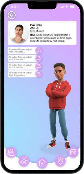
A college navigator and community builder for school clubs at Rutgers, this app also features a custom character creator to boost engagement. Students can create their own unique avatar to represent themselves within the app and their chosen club.
This not only adds a fun and personalized element to the app but also helps students feel more connected to their virtual community. The character creator could offer a range of customization options, from hairstyles and clothing to accessories and facial features, ensuring that each student's avatar is as unique as they are.


Target user
The target user is the modern student, 19-24 year olds, who wants to feel closer to their college community.
15 weeks long
Tool: Figma, Adobe
Platform: App
Context
My role
Conducted user research and created all final visuals.
Problem
Rutgers has issued this Request for Proposals to establish a partner to explore, define and build
an interactive product. As part of the selection process, RFP respondents are asked to develop
a pilot for a program focused specifically on how
to provide the student and faculty population on Rutgers New Brunswick campuses a means to support their own and each other’s identity,
sense of well-being, and day-to-day lives.


Solution
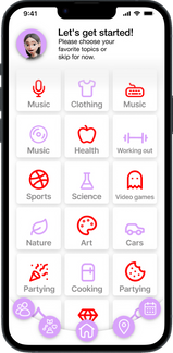
Offer a mobile app that connects students with each other through campus involvement. It allows users to see and register for upcoming events around them based on their interests and hobbies. Features: sync calendars, view friend activity, create groups. A key trait of the app would be an assistant avatar to help users connect better with the app and with the University.
Sketch&
Prototype

-
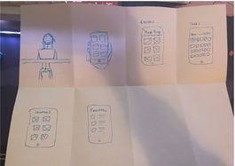
Me and my team started sketching wireframes of what we envision the ideal user interface would be.
Prototype goal
-
To create an easy-to-use onboarding process.
-
Allow users to connect with their character.
-
Quickly access different functions.
-
Create an app that would keep the student users coming back.
-
To create an avatar that would make the user feel connected and invested in the app.

Survey
Multi-question survey delivered virtually to Rutgers Students, understanding the background of our users, understanding the way our users live and interact with the world, understanding the essential parts of life where our users need assistance.
Design Process

-
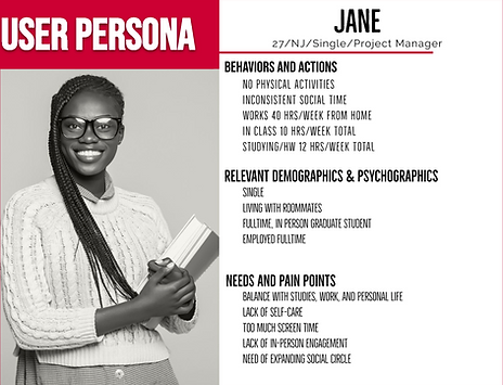
Once the data returned, we organized it and began to form it into a user persona. We found that our average user is a single, 27-year-old female graduate student who lives with roommates and whose current position is a full-time project manager.
-
We started to form Jane’s habits from the survey research that we gathered. Jane has a very inactive lifestyle, having little to no social time, and not going out very much. She spends much of her time working and doing homework.

Perspective user journey
Her morning routine was standardized. She wakes up, does her hygiene regimen, eats, and gets ready for work. The work day for her was mainly performing tasks and delegating work to her coworkers.
Usability Testing
-
We then began a user survey of the wire to learn about its shortcomings and usability.
-
I did the first set of surveys, where I had the user explain how they felt about the product in its early stages and if it was a product they would use in the future.
-
This process took approximately 20 minutes. From this, we learned that our project had potential, and what stood out the most to that user.
Onboarding
What is your first impression?
-
Avatar is cool and interesting.
-
Too much text on Sign up screen.

Calendar
How is the calendar use experience?
-
Using the process is a little complex but can understand how to use it.

Friends Activity
What would you like to see on a friend's activity page?
-
Better to have a pin feature to pin my favorite friends who can see my activity status.

Customize
What do you think of the customization?
-
Not necessarily
-
It should be better to include in the setting

Map
What do you think about this function?
-
Very informational and intuitive
-
Useful for making new friends
-
The add event flow is interesting

Results & Insights
-
Users were OK with sharing personal information.
-
There were split opinions on the customizable avatar.
-
There was confusion about some buttons and their placement.
-
Users expected the calendar functionality to match native calendar apps on their device.
-
Users felt overwhelmed by the button options.
-
There were questions and concerns about location sharing.
Updated UI
Conclusion
The design should focus more on the user in mind, providing a seamless and intuitive experience. The application needs a better focus on user-friendly navigation and should aim to create a positive and engaging experience for Rutgers students. The end result should be encouraging them to stay connected and involved with their campus community.
My work


