CYBERPUNK
2077 APP
My role: UI, UX, Branding
Cyberpunk 2077 is a massively popular video game RPG made by CD projekt red. The game has hundreds upon hundreds of items, characters, location, and lore. This makes finding certain things hard to find, normally companies would have an app that has all this information but CD projekt red never made one. The only one around is a fan made wiki app that's hard to navigate and poorly designed.
Target user
The target user is a busy individual seeking quick, personalized recipe suggestions tailored to available ingredients.
Context
1 month
Tool: Figma, Adobe
Platform: App
My role
Design and developed the app interface, visuals, and user experience.
Problem
1. Users of the original app complained about bad user functionality and lack of updated information.
2. Visually the original application lacked cohesion to the all style of the game leading it to look more like a fan made product and not an official one.
3. Users couldn't find good or useful information.

Average player
With a controller in hand, they dive headfirst into digital battlegrounds, conquering pixelated worlds with precision and panache. Their eyes never waver from the screen as they execute complex combos, masterfully dodge virtual bullets, and outmaneuver foes with unwavering determination. Quick thinking and split-second decisions are their allies, crafting a narrative of exhilarating victories and heart-pounding defeats. In the realm of virtual chaos, this user thrives, channeling adrenaline into pixelated triumphs. Their passion for gaming transcends screens, forging connections with a global community that shares their thirst for high-octane adventure and pixel-perfect glory.


Design system
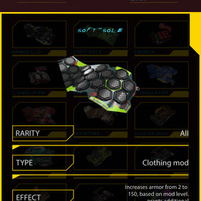
After some contemplation the style of the design system was finalized. The style of it came from that of the original game, making it feel like a seamless intro to the app.

WireFram


Flow Chart


Goal
Keep the app simple, easy to navigate and filled with micro animations. This sticks to the core user's fast-paced nature and shorter attention span. Make the app feel futuristic to match the game's energy and style.
Interaction
-
Responsive
-
Icons designed as SD cards
-
Futuristic
-
Quick and easy to navigate

Advertisement


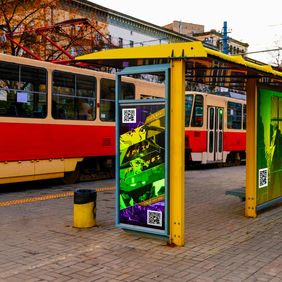
The campaign utilized in-app advertisements on popular gaming and entertainment apps to reach a relevant audience. These ads were interactive and allowed users to learn more about the game and its features, as well as pre-register for the release. The campaign also leveraged the power of influencer marketing by partnering with popular gaming influencers to create content that showcased the game and generated buzz among their followers. This not only helped to reach a wider audience, but also helped to create a sense of community and excitement around the game.


